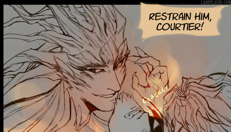
Felt like sharing a small in-progress preview of a panel I’m refining today. It’s Caydren!
Felt like sharing a small in-progress preview of a panel I’m refining today. It’s Caydren!
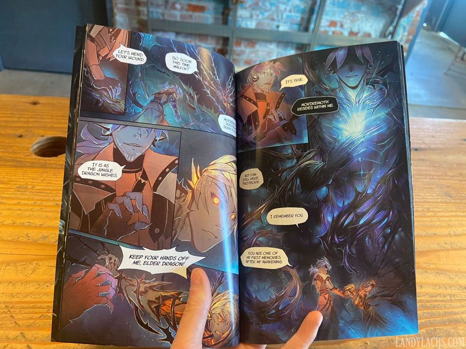
I spent much of the tail end of April finalizing The Harbinger’s Path print version, and wanted to share some photos of one of the book’s proofs from during this time! I ended up spending much more time than I’d planned refining the print version, and despite telling myself not to do this excessively – I ended up manually adjusting or making art refinements to every single page, haha. On the plus side, I’m pleased with how it’s turned out! I think the extra time was worth it, and I hope this comes across to anyone who holds the final book in their hands!
All photos in this post are graciously taken by my printer (many, many thanks to them again for being so wonderful to work with!).
The rest of the photos & post are below, along with one or two higher-resolution photos:
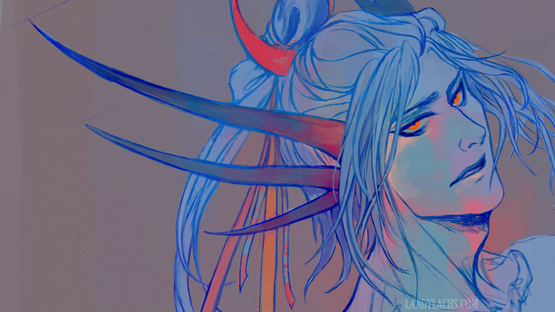
My time has been occupied by trying to squeeze in as many final edits to the book as I’m able to – which has involved some painting, and made me feel like like doing a small paintover of one of my older Laranthir artworks today. I’m not sure if I’ve ever posted the original before, because I wasn’t happy with how it turned out. Above is the paintover from this morning, and the original version is in the full post below:
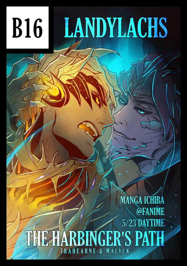
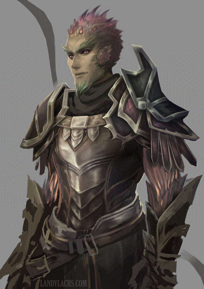
Finished my circle cut for Manga Ichiba! These are used as a way for the convention organizers to show who the participating doujin tables are. It’s carried over from Comiket (“comic markets”) in Japan. In JP, doujinshi are much more commonly created and shared – compared to here in NA, where we don’t have an established doujin culture (…yet!).
I spent far too long deliberating on which artwork to use for my circle cut. I tried several, before ending up doing the least efficient option – refining a very messy sketch from this past October. I saved it knowing I’d like to refine it at some point, but hadn’t until now. This isn’t finished – it’s still quite messy in places – but perhaps that is even more appropriate for a circle cut. From my understanding, they are often sketches done for the specific convention (though correct me if I’m mistaken).
I wanted to do something a little more playful, without being misleading about what the doujin is about. This is what I landed on – hopefully it’s a good compromise! :p
Oh! And as you can read from the image, this also shows info about where and when I will be at the convention. The convention is 3 days, but every doujin table will only be tabling 1 of the 3 days (unlike traditional artist alleys). Below’s the summarized info:
Table Number: B16
Tabling Date: Saturday May 23, 2026
Time: Day slot, 10 am – 4 pm (“General Audiences”)
I’ll have with me The Harbinger’s Path, of course!
I saw a very insightful post on Bluesky the other day, linking to resources detailing the history and ethos of how Comikets in Japan were first established. Much is new information to me! I wanted to link it here, both as a reminder to myself to peruse more leisurely when I have a chance, and in case you might also be interested in reading.
Let me also link directly to the sources, in case Bluesky ever vanishes in the future. Posted originally by the user “saba sabaton” (sabato-n.bsky.social):
Comiket slide deck presentation from 2007/2008
“Comic Market’s Ideals and Vision”
May 4, 2026: Slightly updated the the circle cut art!
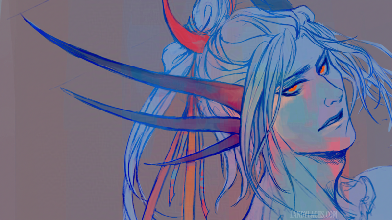
I was playing around with some brush settings last week. This is one of the color tests (the other is Corveil, of course – I’d like to see if I can make him more presentable at some point).